
Swiper を使った様々なスライダー実装
別記事でご紹介のとおり、Boostrap 5 では JQuery 非依存になり、標準では JQuery は読み込まれません。今回ご紹介する Swiper も JQuery を使わずにスライダー機能を実現するプラグインとなりますので、Bootstrap 5 環境に適しています。
Swiper とは?
Swiper はタッチ操作にも対応したスライダーのモジュールであり、多くのオプションが用意されており様々なシーンで利用できます。
Swiper 導入方法
Swiper を利用するには CDN を利用するのがもっとも簡単です。以下の2行を HEAD 内に記述することで利用を開始することができます。
<link rel="stylesheet" href="https://unpkg.com/swiper/swiper-bundle.min.css" />
<script src="https://unpkg.com/swiper/swiper-bundle.min.js"></script>
簡単な実装例
HTML
<!-- Slider main container -->
<div class="swiper-container swiper-name">
  <!-- Additional required wrapper -->
  <div class="swiper-wrapper">
    <!-- Slides -->
    <div class="swiper-slide">スライド1</div>
    <div class="swiper-slide">スライド2</div>
    <div class="swiper-slide">スライド3</div>

  </div>

  <!-- If we need navigation buttons -->
  <div class="swiper-button-prev"></div>
  <div class="swiper-button-next"></div>

</div>
JS
<script>
const swiper = new Swiper('.swiper-name', {
// Optional parameters
// Navigation arrows
navigation: {
nextEl: '.swiper-button-next',
prevEl: '.swiper-button-prev',
},
});
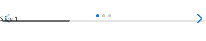
</script>もちろん上記は必要最低限の実装なので、ページを表示してもこんな感じになります。
さて、これをベースに、実際にウェブページで使えるような部品にしていきましょう。
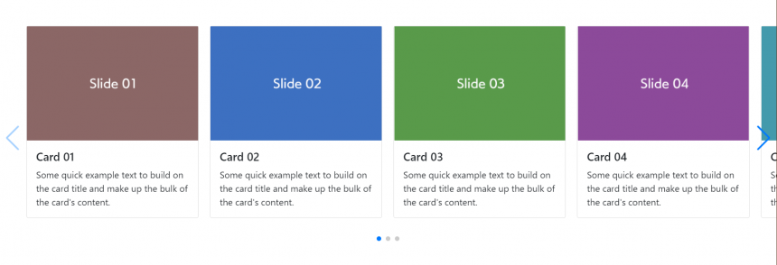
カードのスライダー
Google の検索結果ページ等でよくみられるような、カードがスワイプで次々と表示されるような部品を作ってみます。
HTML
<!-- Slider main container -->
<div class="swiper-container card-swiper px-5">
  <!-- Additional required wrapper -->
  <div class="swiper-wrapper">
    <!-- Slides -->
    <div class="swiper-slide">
       <div class="card">
         <img src="swiper-slide01.png" />
         <div class="card-body"><h5 class="card-title">Card 01</h5><p class="card-text">Some quick example text to build on the card title and make up the bulk of the card's content.</p></div>
       </div>
    </div>

    <div class="swiper-slide">
       <div class="card">
         <img src="swiper-slide02.png" />
         <div class="card-body"><h5 class="card-title">Card 02</h5><p class="card-text">Some quick example text to build on the card title and make up the bulk of the card's content.</p></div>
       </div>
    </div>

    <div class="swiper-slide">
       <div class="card">
         <img src="swiper-slide03.png" />
         <div class="card-body"><h5 class="card-title">Card 03</h5><p class="card-text">Some quick example text to build on the card title and make up the bulk of the card's content.</p></div>
       </div>
    </div>

    <div class="swiper-slide">
       <div class="card">
         <img src="swiper-slide04.png" />
         <div class="card-body"><h5 class="card-title">Card 04</h5><p class="card-text">Some quick example text to build on the card title and make up the bulk of the card's content.</p></div>
       </div>
    </div>

    <div class="swiper-slide">
       <div class="card">
         <img src="swiper-slide05.png" />
         <div class="card-body"><h5 class="card-title">Card 05</h5><p class="card-text">Some quick example text to build on the card title and make up the bulk of the card's content.</p></div>
       </div>
    </div>

    <div class="swiper-slide">
       <div class="card">
         <img src="swiper-slide06.png" />
         <div class="card-body"><h5 class="card-title">Card 06</h5><p class="card-text">Some quick example text to build on the card title and make up the bulk of the card's content.</p></div>
       </div>
    </div>

  </div>

  <div class="swiper-button-prev"></div>
  <div class="swiper-button-next"></div>

</div>
JS
<script>
  const swiper = new Swiper('.card-swiper', {
  // Optional parameters
  slidesPerView: 1,
  spaceBetween: 10,

  // Navigation arrows
  navigation: {
    nextEl: '.swiper-button-next',
    prevEl: '.swiper-button-prev',
  },

  breakpoints: {
    // when window width is >= 480px
    480: {
      slidesPerView: 2,
      spaceBetween: 10
    },
    // when window width is >= 768px
    768: {
      slidesPerView: 3,
      spaceBetween: 15
    },
    // when window width is >= 1024px
    1024: {
      slidesPerView: 4,
      spaceBetween: 20
    }
  }
});
</script>
ここでのポイントは、 JS での breakpoints: で、スマートフォン/レスポンシブ時のカードの表示量を設定しているところです。スマートフォン時はカードが1つ、タブレット時は2~3つ、1024以上の画面では4つ表示という具合にしてあります。
推薦文(Testimonial)
Bootstrap 標準では用意されていない「推薦文」部品も Swiper で実装することができます。
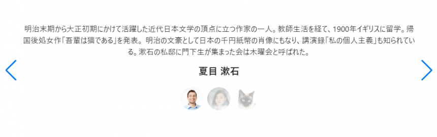
今回の例では、ページネーションをカスタマイズすることにより、サムネイル画像を表示させる方法をご紹介しております。
オリジナルのサンプルではスライダーを2つ作ってそれを同期させたり、他の例では JavaScript でサムネイルのコードを生成するような方法をとったりしていますが、私がご紹介する例は CSS であらかじめ画像を定義しておく安心な方法です。
HTML
<div id="testimonial" class="swiper-container testimonial-swiper">

  <div class="swiper-wrapper">

    <div class="swiper-slide px-4">
      <div class="text-center mx-4">
        <p>推薦文 1</p>
        <h5 class="mb-0">推薦者 1</h5>
      </div>
    </div>

    <div class="swiper-slide px-4">
      <div class="text-center mx-4">
       <p>推薦文 2</p>
       <h5 class="mb-0">推薦者 2</h5>
      </div>
    </div>

    <div class="swiper-slide px-4">
      <div class="text-center mx-4">
       <p>推薦文 3</p>
       <h5 class="mb-0">推薦者 3</h5>
      </div>
    </div>

  </div>

  <div class="swiper-button-prev"></div>
  <div class="swiper-button-next"></div>

  <div class="swiper-pagination"></div>

</div>
JS
<script>
var swiper = new Swiper('.testimonial-swiper', {
  // Optional parameters
  centeredSlides: true,
  loop: true,

  // If we need pagination
  pagination: {
    el: '.swiper-pagination',
    clickable: true,
  },

  // Navigation arrows
  navigation: {
    nextEl: '.swiper-button-next',
    prevEl: '.swiper-button-prev',
  },

  autoplay: {
   delay: 5000,
  },

});
</script>
CSS
<style>
#testimonial .swiper-pagination-bullet {
  width: 48px;
  height: 48px;
  display: inline-block;
  border-radius: 100%;
  opacity: .33;
  background: #000;
  background-size: cover;
}
#testimonial .swiper-pagination-bullet:first-child {background: url('img/testimonial_icon_02.jpg'); background-size: cover;}
#testimonial .swiper-pagination-bullet:nth-of-type(2){background: url('img/testimonial_icon_03.jpg'); background-size: cover;}
#testimonial .swiper-pagination-bullet:nth-of-type(3){background: url('img/testimonial_icon_01.jpg'); background-size: cover;}
#testimonial .swiper-pagination-bullet-active{
  opacity: 1;
  transition-duration:0.2s
}
  .swiper-pagination {position:relative; padding-top:2em;}
</style>
まず HTML / JS の解説です。ここでのポイントは、ループ処理を加えて各スライドがループするようにしたうえで、autoplay で自動的にスライドが切り替わるようにしている点です。サンプルでは 5 秒(5000ミリ秒)でスライドが切り替わるようになっています。またページネーションをクリッカブルにしてあり、任意のスライドへ自由に飛ぶことができます。
そしてページネーション部分の CSS の説明です。通常ページネーションを置くだけだと、黒丸(●)が表示されるだけですが、 .swiper-pagination-bullet で大きさなどをカスタマイズしていきます。
ここで画像を使いたい場合、背景画像として設定するのですが、 .swiper-pagination-bullet に背景画像を設定するとすべての ● に同じ画像が表示されてしまうのでサムネイルとしての意味を成しません。なので各 ● ごとに画像を変える方法として、CSS の :first-child および :nth-of-type(n) を使い、各要素用に個別の背景画像を設定していきます。
また、ページネーションが Active な場合、 .swiper-pagination-bullet-active というクラスになるので、通常時は不透明度 33%( opacity: .33; )、アクティブ時の不透明度を 100% ( opacity: 1; )にしてあげることで、視覚的な Active / 非 Active の違いを表現することができます。
そして ページネーションの部品はスライドと被らないように下に配置したいため、 .swiper-pagination クラスに position:relative; を加えてあります。
以上のような実装で、比較的簡単にサムネイル画像付きの推薦文を作成することができます。
このほかにもさまざまな活用例はあり、Swiper のデモページで確認することができます。是非活用してみてください。


